Inventory Usage
This graph shows the quantity and value of inventory items and the stages. All the stages are displayed in the legend.
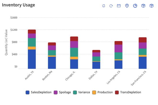
Refer to the following table for the details of icons displayed in this graph:
|
Icon |
Description |
|---|---|
|
|
Click to reset the date and location filters of this graph to the default selections.
|
|
|
Click to refresh the graph. |
|
|
Select preferred date range to generate the graph. By default, the past 7 days will be selected. |
|
|
Select preferred locations to generate the graph. By default, all locations will be selected. |
|
|
Select the preferred types of inventory item usage. The following are the options displayed in this filter:
|
|
|
All inventory types in the property will be displayed as options in this drop-down list and by default, all options will be selected. |
|
|
Select what must be displayed in the Y-axis of the graph. The following are the available options in this filter:
|